Redesigning the Kopo Kopo Android App
Kopo Kopo wanted to refresh their Android app with a modern redesign in preparation for their upcoming iPhone app release.
Introduction
Kopo Kopo is a top fintech company based in Kenya that helps businesses accept mobile and card payments easily and securely. They also offer credit services to support business growth.
While Kopo Kopo’s Android app had been serving businesses effectively, its design was starting to feel outdated. A redesign was needed to not only give the app a fresh, modern look but also to ensure a smooth transition for users and create a consistent experience across different mobile platforms.
Goals
- Modernize the mobile app: Update the app’s visual identity to align with Kopo Kopo’s brand while making the user interface cleaner and more engaging.
- Minimize user friction: Ensure that the redesign feels intuitive and doesn’t disrupt the way existing users interact with the app.
My Role
As the lead Product Designer for this project, I was responsible for:
- Creating high-fidelity mockups using Figma
- Collaborating closely with developers to ensure the final product met design and usability standards
- Focused on user-centered improvements
The Redesign Process
When I joined the project, some groundwork had already been laid, but one of my top priorities was ensuring a smooth user transition with the redesign.
In the months leading up to the redesign, Kopo Kopo introduced major features that altered some of the app’s functionality. While these enhancements greatly benefited our users, they also changed familiar user flows, leading to some frustration among our users as they adjusted to these new changes.
To prevent further friction, we focused primarily on refining the user interface while implementing several key UX improvements. More in-depth UX refinements were scheduled for future updates, informed by user research and feedback.
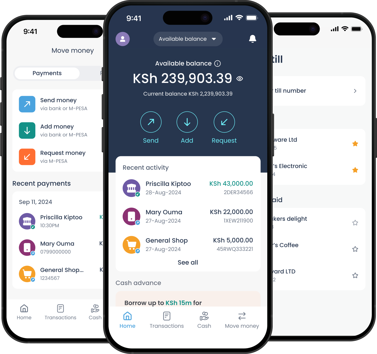
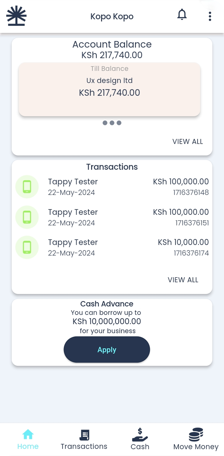
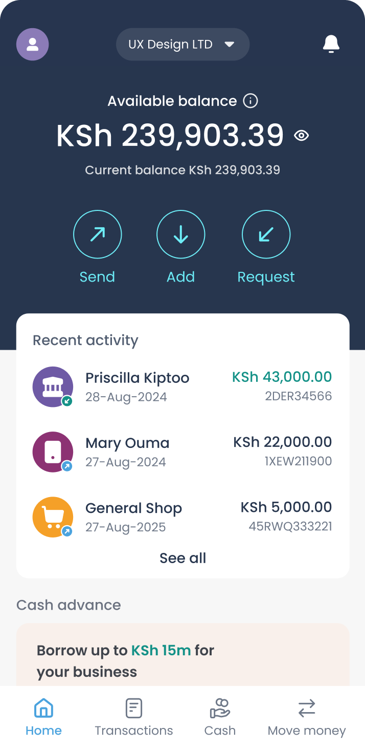
Adding a Dash of Colour
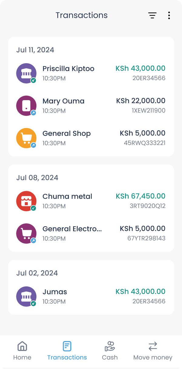
Kopo Kopo’s brand includes a range of secondary colours that were previously underutilized in the app. I saw an opportunity to breathe new life into the design by incorporating these colours.
Initially, I considered assigning colours based on transaction types, but I realized that the majority of users use just two transaction types. This meant they would only see two colours which would limit the vibrancy I was aiming for.
To get around this, I opted to assign random colours to transactions. This small change significantly enhanced the visual appeal, making the app feel fresher and more engaging.
Enhancing UX for Key Features
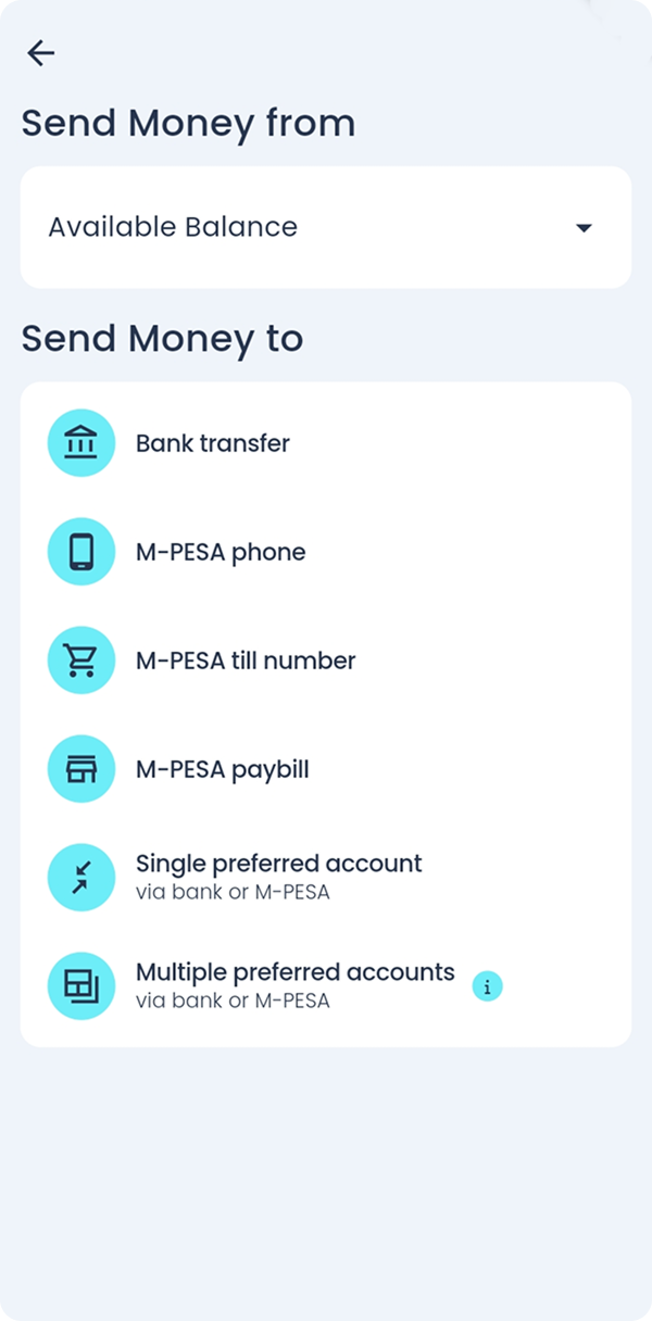
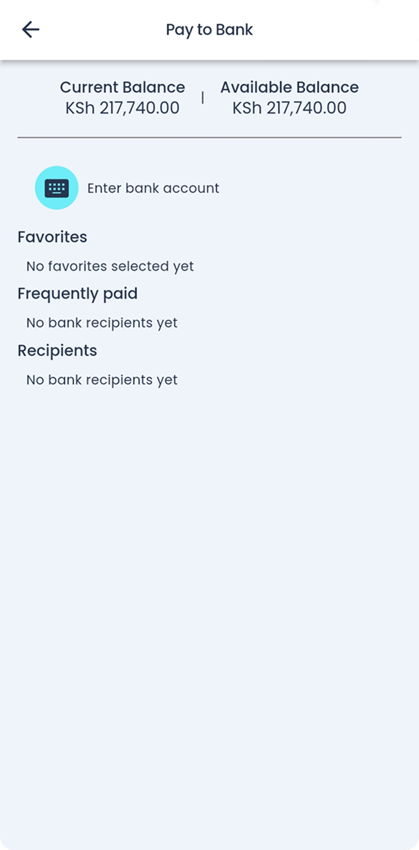
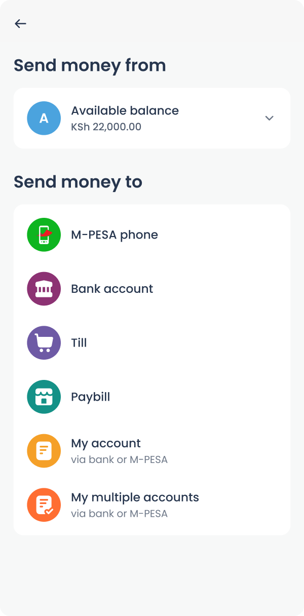
Before the redesign, several new features had been introduced, enabling users to easily move money in and out of their accounts. However, these functions were placed under a tab, making them less accessible.
To improve the user experience, we placed them directly on the home page for quick and easy access.
Results
The redesigned app exceeded our expectations, surpassing our initial goals.
The app was received well with mostly positive reviews, with minimal complaints. This validated our focus on minimizing friction during the transition.
Here are what users on Google Play have to say.


Impact
Additionally, we saw a 12% revenue increase in that quarter, which we directly attributed to the redesign.
This growth stemmed from the small yet impactful UX enhancements that made it easier for users to engage with key features introduced months earlier.
This redesign demonstrated how thoughtful UI/UX changes can drive business growth.
Special Thanks
I want to send a special thanks to the Product and the mobile teams at Kopo Kopo who worked tirelessly to bring this vision to life. Onto the next one.